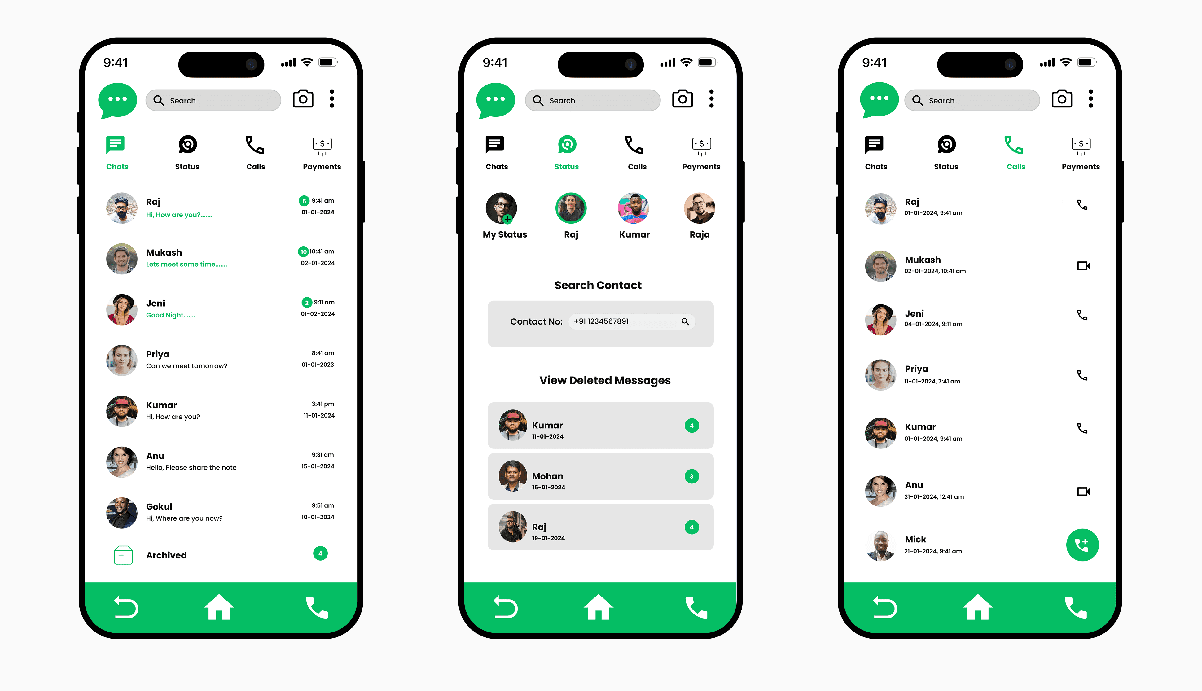
UI/UX Case Study - Chat App - Chatdot
Chatdot is a modern messaging application built to simplify communication while keeping it personal and engaging. The idea was to craft an experience that feels fast, fluid, and human — enabling users to connect effortlessly through clean design and meaningful interactions.
Communication Technology
Mobile App Design
June 15, 2025

Project Goal
To design a seamless chat experience that combines clarity, speed, and personality — allowing users to communicate naturally without distractions or confusion.
Challenges Addressed
In the initial research, several usability and engagement issues were identified that affected overall communication flow.
Overloaded interface: Too many visual elements made conversations feel cluttered.
Unclear message hierarchy: Important chats and unread messages were difficult to distinguish.
Weak personalization: Users lacked options to customize themes or chat preferences.
Inconsistent visual rhythm: The UI lacked balance and emotional tone suitable for messaging.
Design Approach
A collaborative and user-empathy-driven design process was applied to create a refined chat experience:
Research & user mapping: Studied daily communication habits and pain points of frequent chat users.
Information structuring: Organized message threads, contacts, and notifications into clear patterns.
Prototyping & testing: Built interactive flows to ate navigation, readability, and feedback responses.
Refinement & design system: Established consistent Ul components for scalable future updates.
Design Concept
The design concept focuses on minimalism infused with warmth — a balance between function and emotion. Soft gradients, rounded elements, and smooth transitions give the app a conversational flow that mirrors real human interaction. Each visual decision, from color choice to typography, supports readability and comfort, ensuring that Chatdot feels both modern and personal.
